
Treehouse Go App
Launched 2015
The team at You.i TV was brought on to design and develop Corus Kids’ television properties. The first property we launched was Treehouse Go. We reimagined the video app experience and designed it just for kids.
As Senior Interaction Designer, my responsibilities were:
Leading the project from pitch to launch
Prioritize and define requirements with analysts
Plan and execute user testing
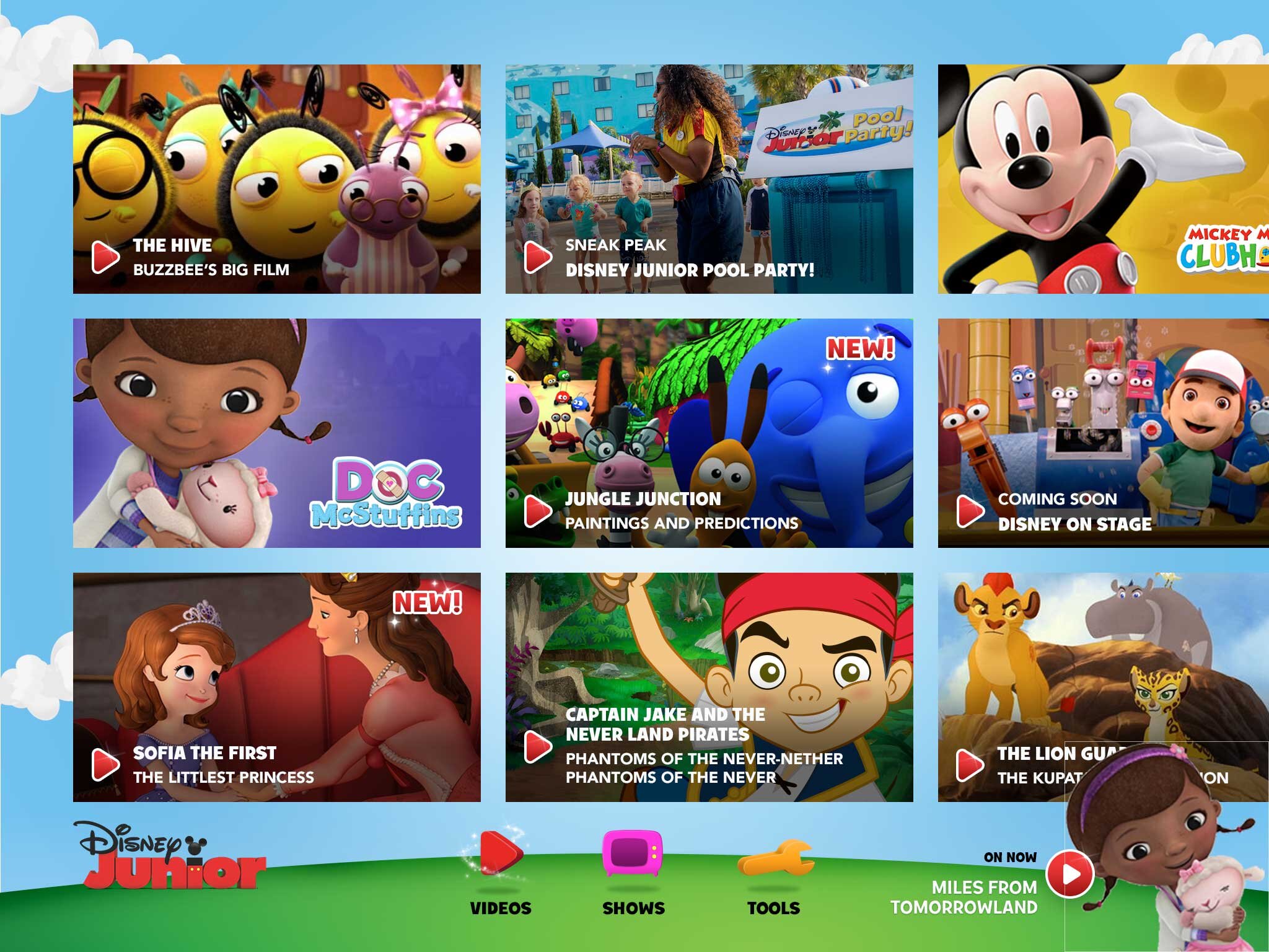
Designing a Kid Friendly App
The core audience were kids ages 2 to 5 - think Dora the Explorer and Peppa Pig. Designing for this age is super fun but comes with a set of unique challenges. The app needed to be flawless in terms of usability and at the same time fun to use!

No text
Kids this age can’t read yet, so the challenge here was to build an entire interface without text.

Tiny hands
Those sticky little hands are clumsy and so the UI needed to be accomodating.

Limited gestures
No two finger swipe or pinch gestures for our pint sized users. Gestures were limited to taps.

There were lots of fun whiteboard board sessions.
The team had a lot of fun working on Treehouse. The whiteboards were covered with our crazy ideas. We worked closely with developers to bring Treehouse to life.

I built rough prototypes early on and tested often.
At every milestone of the project, I tested the UI with kids. It was imperative to Corus that kids could use the app independent of parental guidance.
The Core Elements of Treehouse
We created a Treehouse environment that kids could swipe through to search for their favourite show by character. All the grown up stuff is at the top in the “hard to reach” zone. There are only two main targets on screen and as an added feature, I designed “happy accidents.” along the edges of the screen, which if accidentally tapped would trigger a surprise animation.

Large targets for tiny hands
Buffer area to prevent accidental taps - where the “happy accidents” happen
Parent button placed in hard to reach zone
Horizontal scrolling for easy browsing

1. Home
2. Live TV
3. Player
4. Download
5. Offline mode
6. Offline player
7. Baby gate
8. Content management
9. Content restriction
10. Settings
11. Timer
12. About
13. Provider Authentication
Treehouse Home
The home screen is all visual. Kids explore the environment and search for their favourite show by character. There are little easter eggs sprinkled throughout for that element of fun.

All in One Video Player
To keep navigation simple, screens were kept to a minimal: home and video player. Within the video player, they can choose their favourite episode from the content drawer.

Download to Go
This was a core feature that allowed kids to download and watch videos offline. We used based the design using a metaphor kids would understand: the backpack. They would drag an episode into the backpack and that’s it. When the app is offline you open the backpack and the videos downloaded are inside.


Visual designs by Matt Emond
More Corus Kids Apps
Once Treehouse was launched, Nickelodeon and YTV followed. Since I had already designed the foundation using Treehouse, I retrofitted the interface for an older demographic - ages 5 to 12.

Visual designs by Matt Emond
Visual designs by Dima Badawi

Visual designs by Pascal Potvin